Postingan

Menampilkan postingan dari Juli, 2017

Lighting 103: Use Color to Evoke Time and Place

Gambar
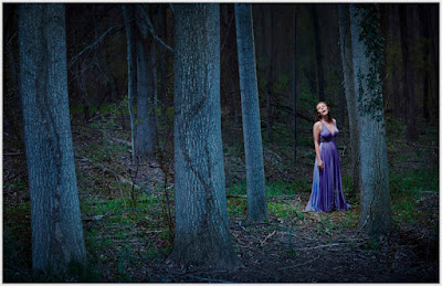
Abstract: It can be scary to add a lot of color to your light. But it's easy to underestimate how much color it takes to transform a scene and set a mood. Don't be shy. Those gels won't bite. This nighttime portrait of soprano Alexandra Rodrick was a big step for me. It was made about five years ago, when I was just starting to realize how color-fluid real light could be. I kinda knew it, but I still didn't have the nerve to actually do it. So I took a deep breath and threw way more blue into the environment than I normally would. And not only did I come out alive on the other side, but I ended up pretty happy. Read more »

Lighting 103: Avoiding Cross Contamination

Gambar
Abstract: When complementary-gelled lights are falling on the same plane, they can easily rob each other of color. So it is important to make sure your lights are hitting different areas, with minimal overlap. Above is a two-speedlight portrait against a white wall. White walls are the natural enemy of a gel, and practically live to wash out your color. Especially when using two flashes with dense, complementary gels. Knowing how to keep your multi-colored lights operating on different planes will help you retain more saturated color. Let's walk through the portrait above to get a better look at how our two lights are working separately—and together—in a variety of ways. Read more »